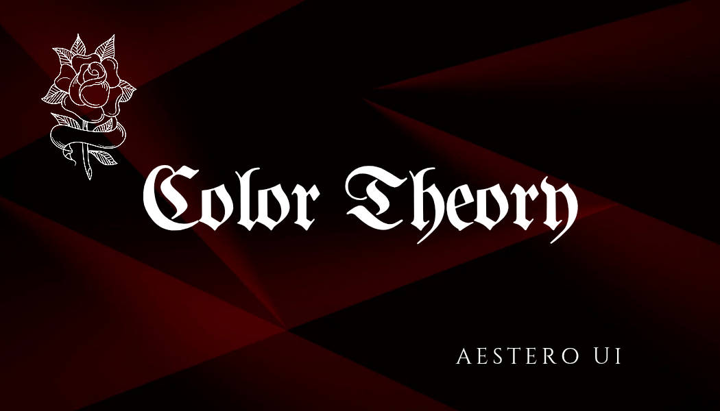
The Power of Color Theory in Web Design: Enhancing User Experience and Engagement
2025-02-27
The Role of Color Theory in Web Design: How Colors Influence User Behavior and Experience
Color is one of the most powerful tools in web design, shaping user perception, influencing emotions, and guiding interactions. The right color scheme can make a website visually appealing, enhance readability, and even encourage user engagement. However, using colors effectively requires an understanding of color theory—the principles governing how colors interact and how they affect human psychology.
Understanding Color Theory in Web Design
In web design, color theory is essential for creating a visually cohesive and aesthetically pleasing layout. By using color harmony, designers can ensure that their websites are easy on the eyes and effectively communicate the intended message. In web design, color theory is essential for creating a visually cohesive and aesthetically pleasing layout. By using color harmony, designers can ensure that their websites are easy on the eyes and effectively communicate the intended message.
The Three Core Aspects of Color Theory in Web Design
Hue – The basic identity of a color (e.g., red, blue, green).
Saturation – The intensity or purity of a color. High saturation results in vibrant colors, while low saturation creates muted tones.
Brightness – How light or dark a color appears, affecting readability and contrast.
The Psychology of Colors: How Colors Affect User Behavior
Different colors evoke different emotions and psychological responses. Understanding color psychology allows web designers to create experiences that align with their brand message and influence user behavior.
Red: Urgency and Excitement
Red is a high-energy color that evokes feelings of passion, urgency, and excitement. It is often used for call-to-action (CTA) buttons to grab attention and encourage immediate responses. Many e-commerce sites use red for (Buy Now) or (Limited Offer) buttons to create a sense of urgency. However, too much red can feel overwhelming, so it should be used strategically.
Blue: Trust and Professionalism
Blue is associated with trust, security, and calmness. It is widely used by financial institutions, healthcare providers, and corporate websites to establish credibility. Blue is also effective in reducing stress and promoting a sense of reliability, making it ideal for websites that require user trust.
Yellow: Optimism and Attention
Yellow is a bright and cheerful color that conveys happiness and energy. It is often used to capture attention, making it ideal for highlighting key information or promotions. However, excessive yellow can cause eye strain, so it’s best used in moderation as an accent color.
Green: Growth and Balance
Green represents nature, health, and financial success. It is commonly used by eco-friendly brands, wellness companies, and financial institutions. Green is also easy on the eyes and can create a sense of relaxation, making it a great choice for websites that aim to provide a calming user experience.
Black: Sophistication and Elegance
Black is a powerful and sophisticated color often associated with luxury and exclusivity. High-end brands and fashion websites frequently use black to create a sleek and modern aesthetic. However, when overused, black can make a website feel heavy and uninviting.
White: Simplicity and Cleanliness
White represents simplicity, purity, and minimalism. It is commonly used in modern web design to create negative space (white space), improving readability and focus. White backgrounds help create a clean and clutter-free design that enhances user experience.
Creating an Effective Color Scheme for Your Website
Choosing the right color palette is essential for branding and usability. A well-balanced color scheme enhances the user experience and strengthens brand recognition.
Use the 60-30-10 Rule
60% Primary Color – The dominant color of your website (e.g., background).
30% Secondary Color – A complementary color that enhances contrast (e.g., menus or sidebars).
10% Accent Color – A highlight color for important elements (e.g., buttons, CTAs).
Final Thoughts
Color theory is a fundamental aspect of web design that directly influences user perception and behavior. By understanding the psychological effects of different colors and applying effective color schemes, web designers can create visually appealing, user-friendly, and engaging websites.
Whether you’re designing a professional corporate site, an e-commerce platform, or a creative portfolio, choosing the right colors can enhance user experience, boost conversions, and strengthen your brand identity. Start experimenting with color theory today and bring your website to life with a well-crafted color palette! 🎨🚀